Torpedo7 (part of The Warehouse Group) is a popular New Zealand retail store, for all adventure gear needs across indoor and outdoor sports and activities. We were tasked to create a market-leading digital storefront and community – the best for outdoor adventure.
As an Experience Lead on this project, I worked with the head of design, business stakeholders, product owner and UI designer to set the UX vision and redesign the online shopping website. Apart from UX discovery and design, I also worked with the project manager on project timelines, facilitating sprint rituals, managing expectations and collaborating with business and other stakeholders.
We started with understanding current user pain points through user testing on the old website and doing a UX audit to identify opportunities.
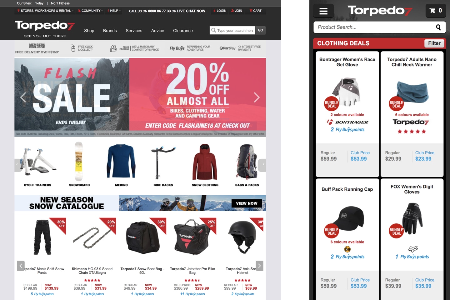
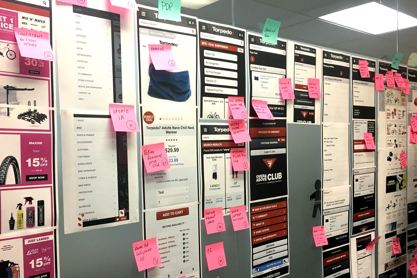
There was a limited budget and time for the redesign project, making planning even more crucial to achieve our goals. We created a sprint-based project plan, focussing on delivering a part of the core flow at the end of every 2-week sprint. Planning in sprints helped us in having a lean approach which we could iterate on in case of any dependencies and blockers.
Redesign initiative was also an opportunity for us to build a design system from the ground up. We built upon some existing components to test its scalability, and also created a few new ones which could be used across other TWG brands.
We started every sprint with documenting business and user requirements, together with the business stakeholders and product manager. Identifying the various JTBD (jobs to be done) for the flow we're focussing on, helped define the scope and UX goal. As part of the discovery, we also looked at benchmarks and the latest customer feedback from Hotjar, to help us set a direction for the rest of the sprint.
Inspire and lead users towards a confident purchase.
Help users move faster in their purchase journey.
Demonstrate expertise by showcasing a range of professional services.
Influence the ‘inspirational’ navigation path to products with experience-led content.
At the start of every sprint, we added granular tasks we wanted to complete across the two weeks, helping us stay on track with the timelines. UI designer and I worked a sprint apart, with me focusing more on the discovery & design, and her focusing more on design & delivery while regularly collaborating throughout the process.
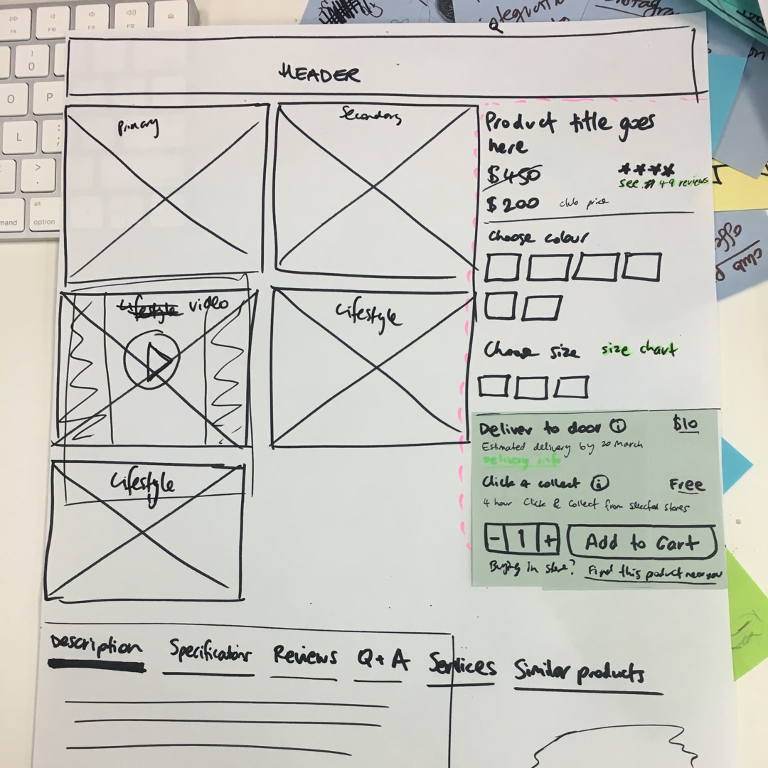
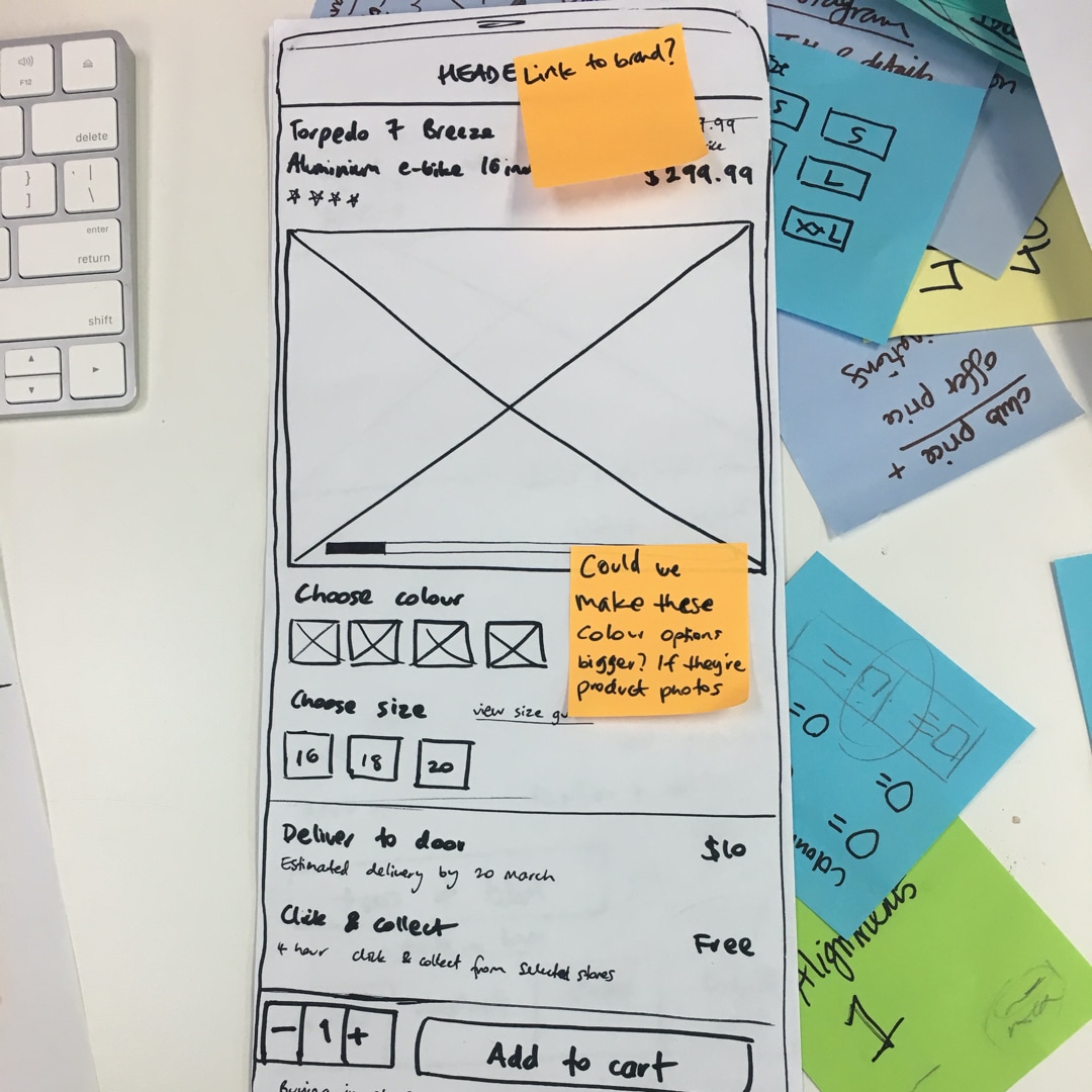
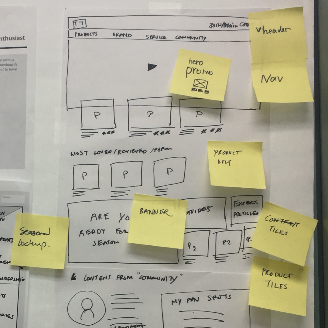
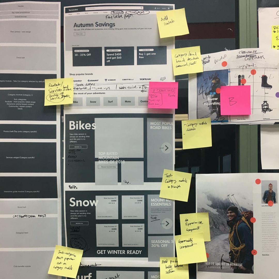
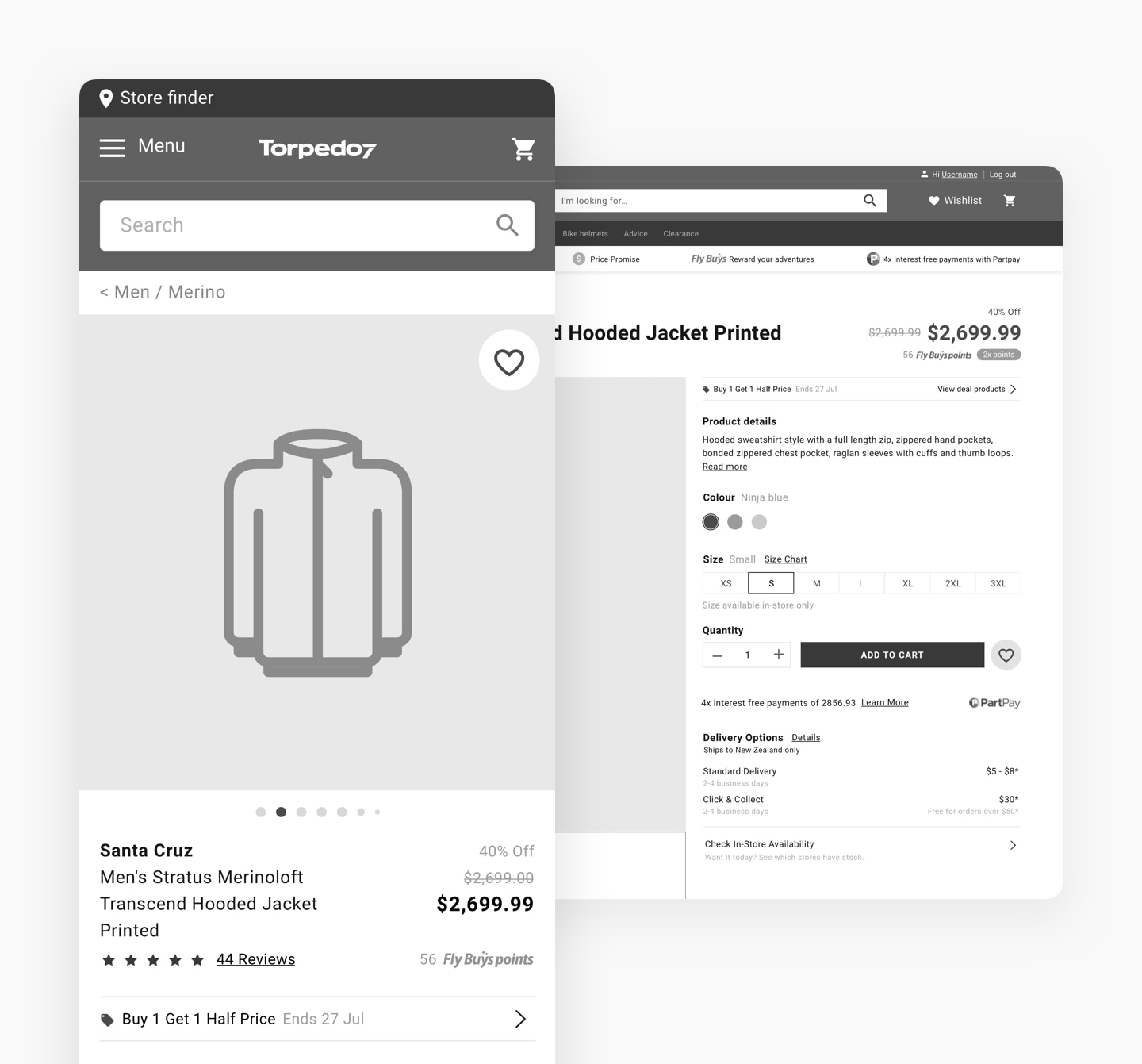
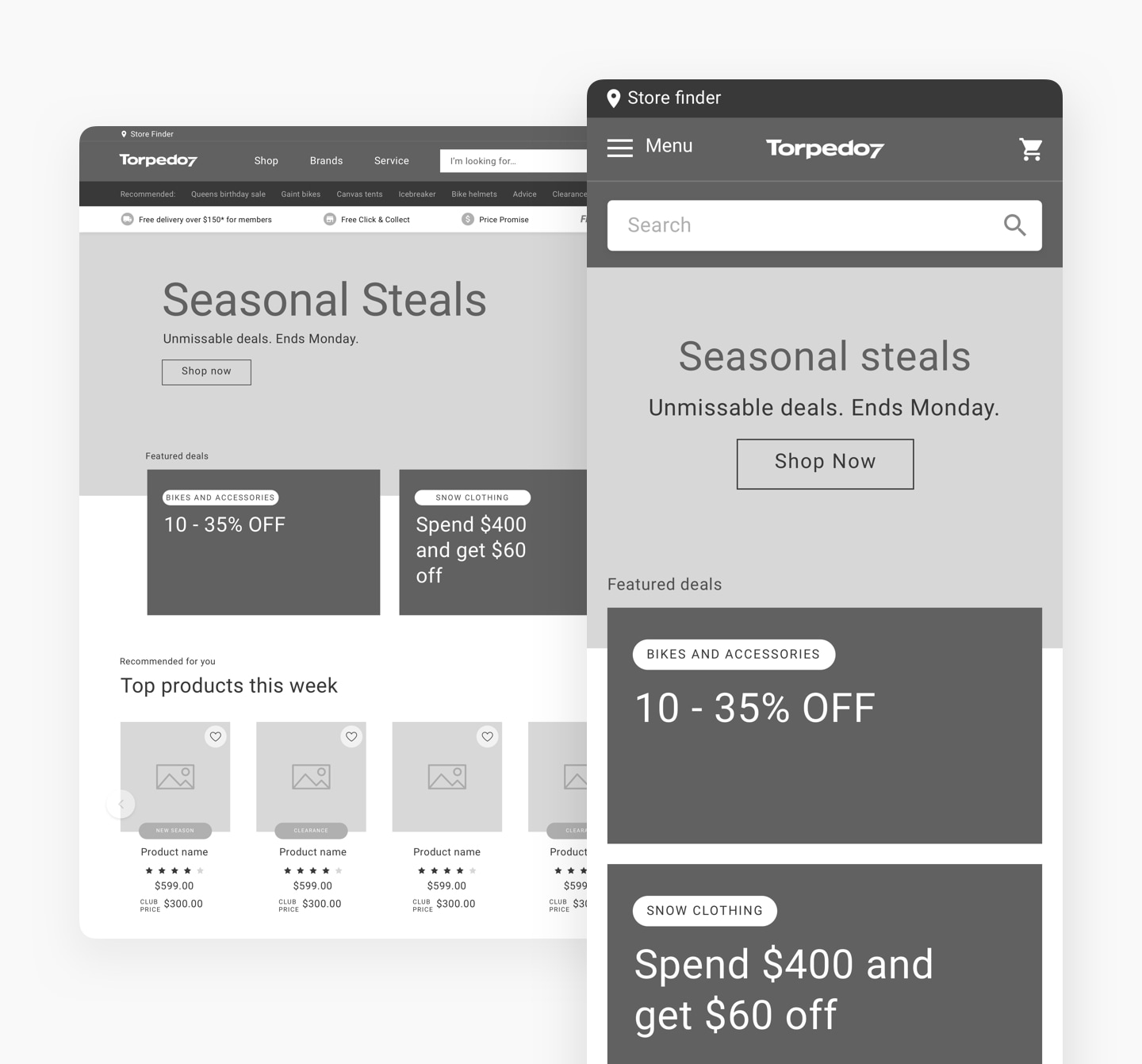
Based on the sprint goals, we either did usability testing on a part of the online purchase flow or on specific pages.
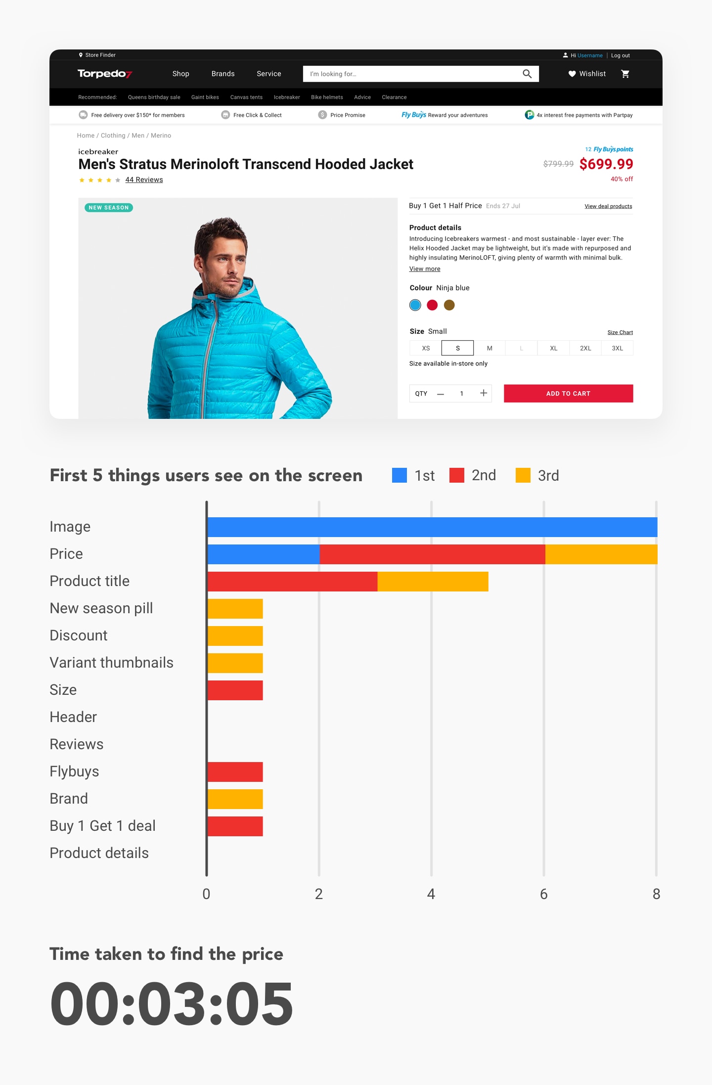
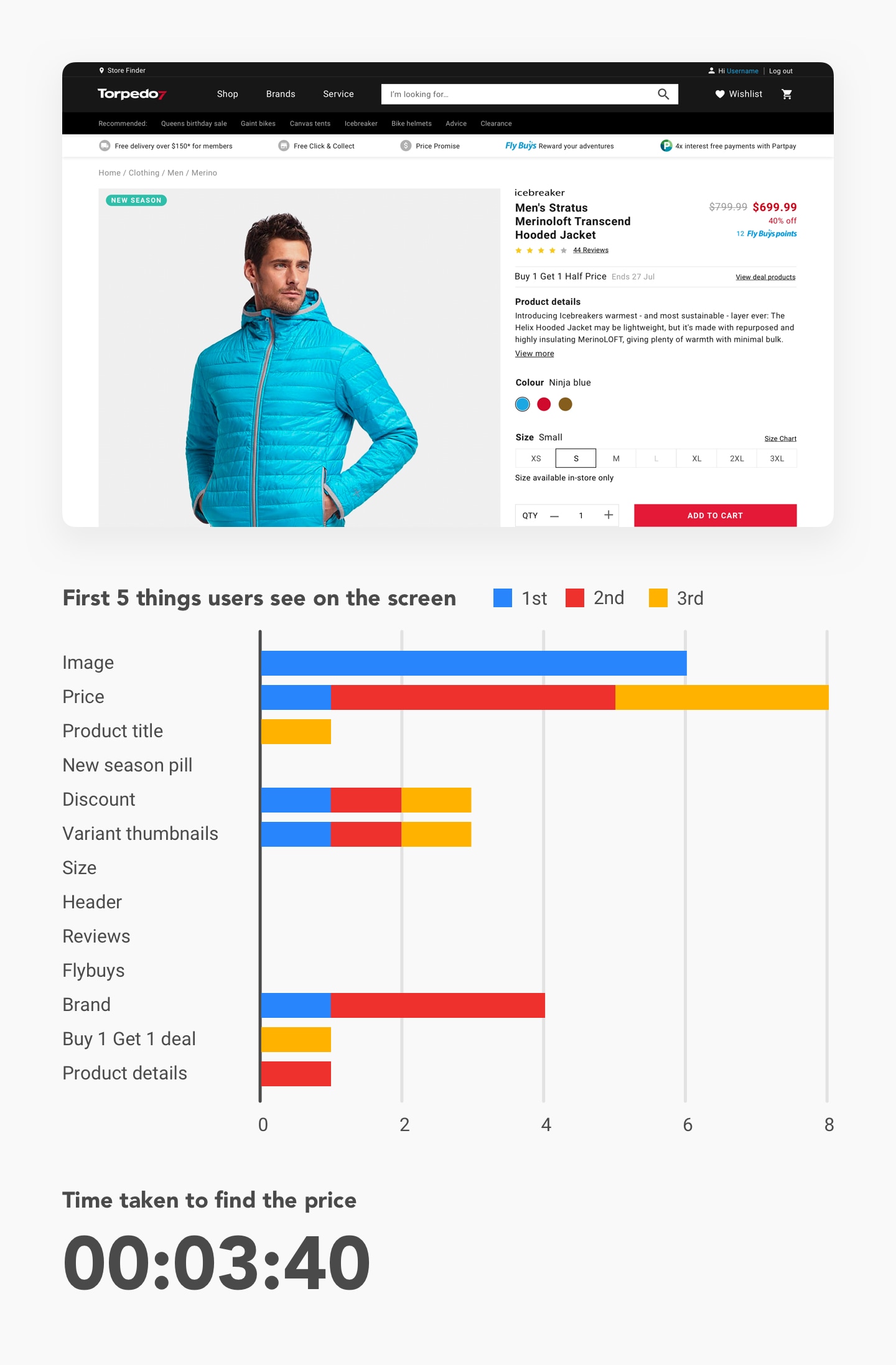
In one of the user test, we wanted to identify on product details page, which price lockup makes it easier for users to know the product price. We tested with two groups of people, where participants in each group were shown one of the two options. Half of one group was tasked with finding the product price, and we asked the other half to tell us the first five things they noticed on the screen.
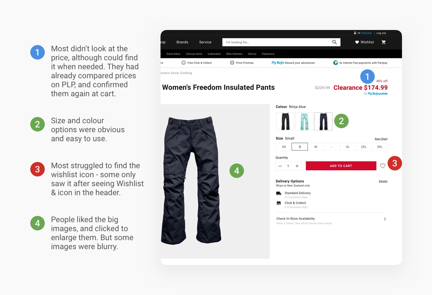
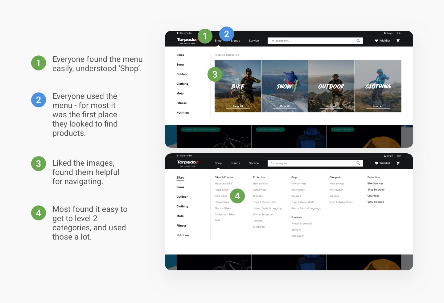
Our UX researchers also conducted a round of user test on the new website post-implementation to identify opportunities and further improve the e2e experience.
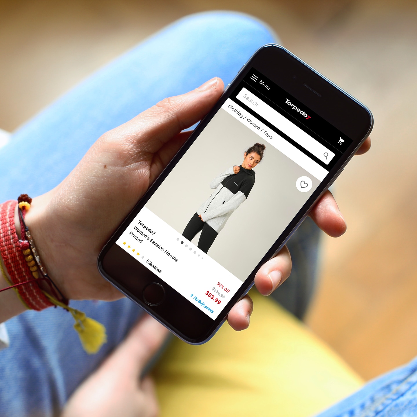
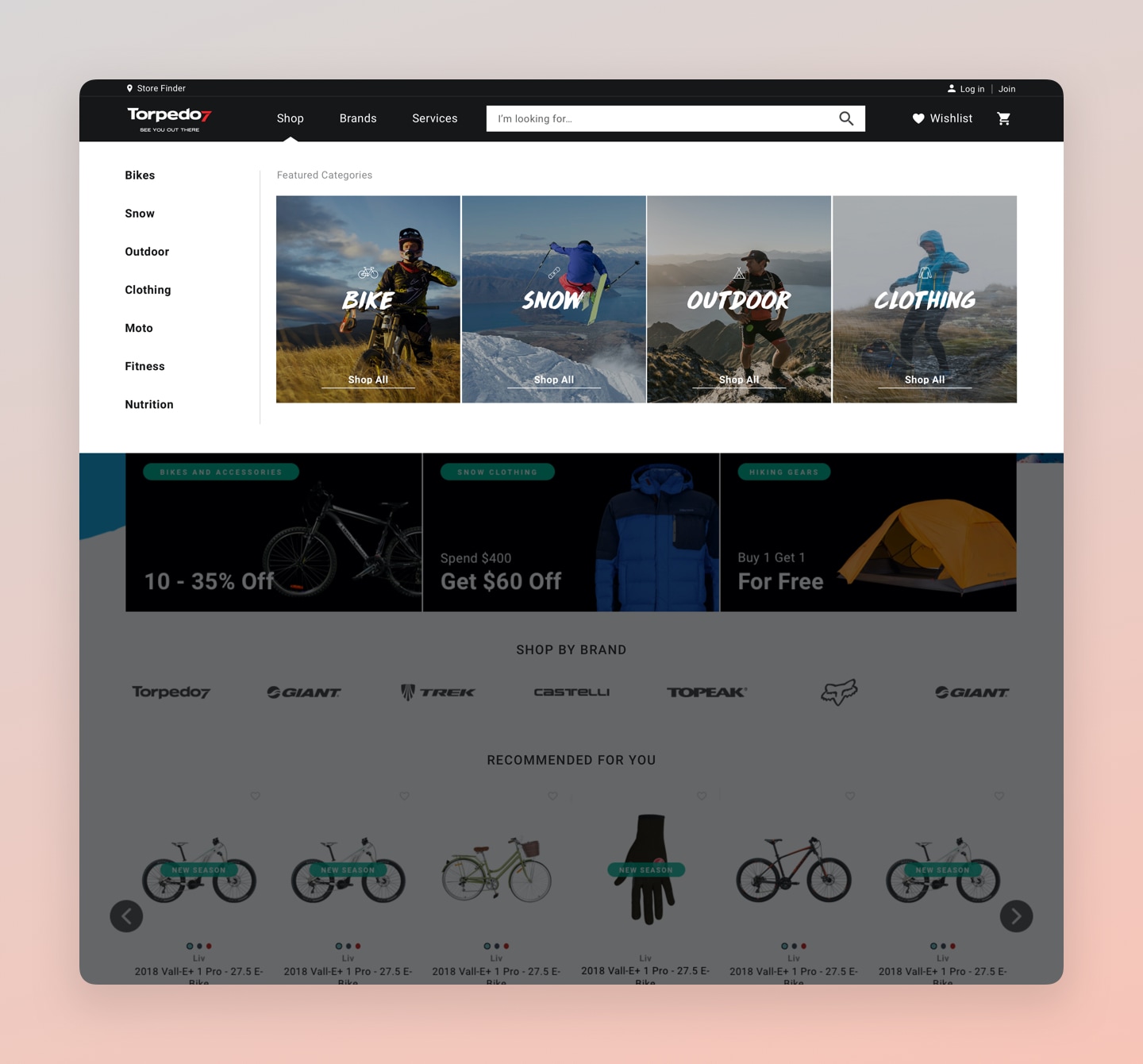
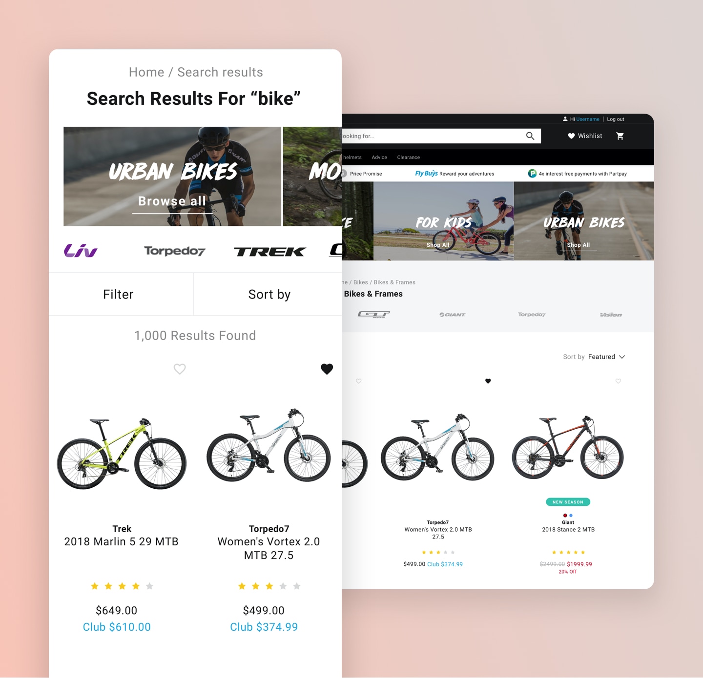
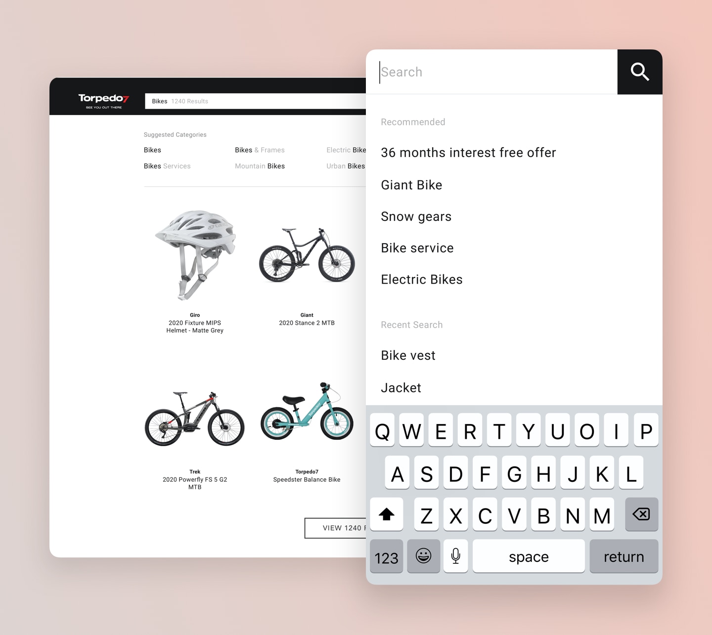
After the excitement post phase 1 launch, looking at the results and the feedback from customers and business was gratifying. Just a few months after the launch, we saw an increase in the mobile conversion rate from 0.52% to 0.75%. Moving forward, this also created a great space for the team to keep optimising the experience and continue improving on the results.